
This lesson is all about building a user interface that is well-organized and accessible. We’ll be building a sample app where we’ll learn about different styles of layouts, views and view groups, as well as data binding, and accessibility.
Index
- Views and View Groups
- Constraint Layout
- Vector Images
- Hierarchy Viewer
- Data Binding
- Accessibility
- Localization
- Responsive Design
Views and View Groups
The Android View class and ViewGroup class are two very central classes in Android apps. An Android app contains one or more activities. An Android activity is a screen, similar to windows in a desktop application. Inside an activity you can have GUI components. The GUI components are instances of View or ViewGroup subclasses.
The View class is a superclass for all GUI components in Android. This class represents the basic building block for user interface components. A View occupies a rectangular area on the screen and is responsible for drawing and event handling. View is the base class for widgets, which are used to create interactive UI components (buttons, text fields, etc.)
TextViewEditTextImageViewProgressBarButtonImageButtonCheckBoxDatePicker
The ViewGroup class is a subclass of the View class. A ViewGroup is a special view that can contain other views (called children.) The view group is the base class for layouts and views containers.
LinearLayoutRelativeLayoutListViewGridViewConstraintLayout
Some of the mpore relevant properties of the views are:
android:layout_height&android:layout_width: describes how big the view wants to be for both width and height. For each dimension, it can specify one of:
- FILL_PARENT (renamed MATCH_PARENT in API Level 8 and higher), which means that the view wants to be as big as its parent (minus padding).
- WRAP_CONTENT, which means that the view wants to be just big enough to enclose its content (plus padding).
- an exact number.
android:layout_gravity: Gravity specifies how a component should be placed in its group of cells. The default isTOP.android:padding: Sets the padding, in pixels, of all four edges. Padding is defined as space between the edges of the view and the view’s content. A view’s size will include its padding. If a background is provided, the padding will initially be set to that (0 if the drawable does not have padding). Explicitly setting a padding value will override the corresponding padding found in the background.android:visibility: Controls the initial visibility of the view. Must be one of the following constant values.
goneCompletely hidden, as if the view had not been added.invisibleNot displayed, but taken into account during layout (space is left for it).visibleVisible on screen; the default value.
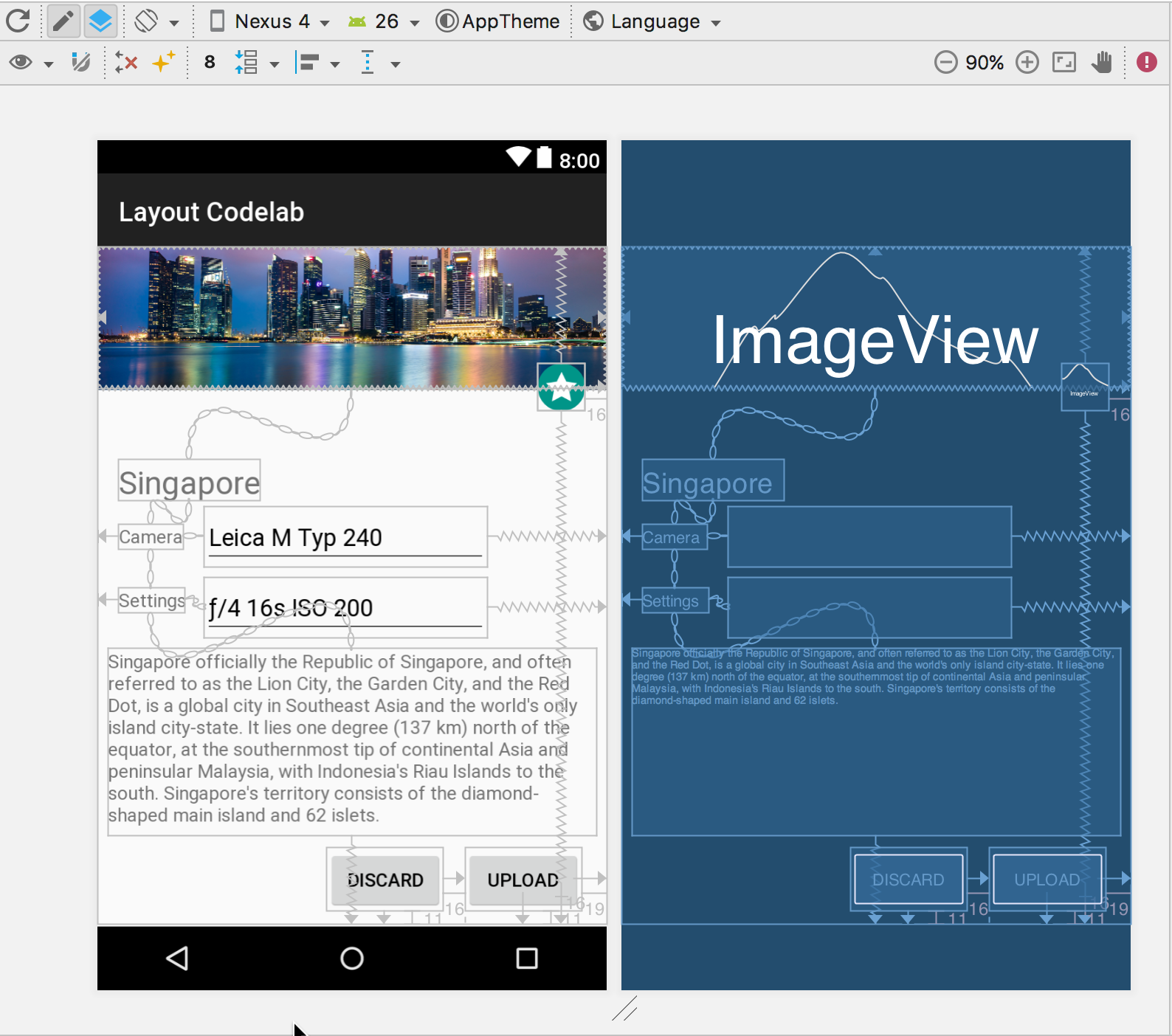
Constraint Layout
ConstraintLayout allows us to create large and complex layouts with a flat view hierarchy (no nested view groups). It’s similar to RelativeLayout in that all views are laid out according to relationships between sibling views and the parent layout, but it’s more flexible than RelativeLayout and easier to use with Android Studio’s Layout Editor.
All the power of ConstraintLayout is available directly from the Layout Editor’s visual tools, because the layout API and the Layout Editor were specially built for each other. So we can build our layout with ConstraintLayout entirely by drag-and-dropping instead of editing the XML.
The aim of the ConstraintLayout is to help reduce the number of nested views, which will improve the performance of our layout files. The layout class also makes it easier for us to define layouts than when using a RelativeLayout as we can now anchor any side of a view with any side of another, rather than having to place a whole view to any side of another.
The ConstraintLayout features several more attributes:
layout_constraintTop_toTopOf— Align the top of the desired view to the top of another.layout_constraintTop_toBottomOf— Align the top of the desired view to the bottom of another.layout_constraintBottom_toTopOf— Align the bottom of the desired view to the top of another.layout_constraintBottom_toBottomOf— Align the bottom of the desired view to the bottom of another.layout_constraintLeft_toTopOf— Align the left of the desired view to the top of another.layout_constraintLeft_toBottomOf— Align the left of the desired view to the bottom of another.layout_constraintLeft_toLeftOf— Align the left of the desired view to the left of another.layout_constraintLeft_toRightOf— Align the left of the desired view to the right of another.layout_constraintRight_toTopOf — Align the right of the desired view to the top of another.layout_constraintRight_toBottomOf— Align the right of the desired view to the bottom of another.layout_constraintRight_toLeftOf— Align the right of the desired view to the left of another.layout_constraintRight_toRightOf— Align the right of the desired view to the right of another.
If desired, attributes supporting start and end are also available in place of left and right alignment.
Before we get started, there’s a few things we’ll need to do if we want to use ConstraintLayout.
- To begin with, we’ll need to use Android Studio version 2.2 or later.
- We’ll also need to add the dependency for the
ConstraintLayoutfrom the support library in our app’sbuild.gradlefile::
compile 'com.android.support.constraint:constraint-layout:1.0.2'
Vector images
A VectorDrawable is a vector graphic defined in an XML file as a set of points, lines, and curves along with its associated color information. The major advantage of using a vector drawable is image scalability. It can be scaled without loss of display quality, which means the same file is resized for different screen densities without loss of image quality. This results in smaller APK files and less developer maintenance. You can also use vector images for animation by using multiple XML files instead of multiple images for each display resolution.
<!-- res/drawable/battery_charging.xml -->
<vector xmlns:android="http://schemas.android.com/apk/res/android"
    <!-- intrinsic size of the drawable -->
    android:height="24dp"
    android:width="24dp"
    <!-- size of the virtual canvas -->
    android:viewportWidth="24.0"
    android:viewportHeight="24.0">
   <group
         android:name="rotationGroup"
         android:pivotX="10.0"
         android:pivotY="10.0"
         android:rotation="15.0" >
      <path
        android:name="vect"
        android:fillColor="#FF000000"
        android:pathData="M15.67,4H14V2h-4v2H8.33C7.6,4 7,4.6 7,5.33V9h4.93L13,7v2h4V5.33C17,4.6 16.4,4 15.67,4z"
        android:fillAlpha=".3"/>
      <path
        android:name="draw"
        android:fillColor="#FF000000"
        android:pathData="M13,12.5h2L11,20v-5.5H9L11.93,9H7v11.67C7,21.4 7.6,22 8.33,22h7.33c0.74,0 1.34,-0.6 1.34,-1.33V9h-4v3.5z"/>
   </group>
</vector>
To add a downloaded vector image to our application, download that SVG file and then head back to the Android project, right click on the res folder, and then select New vector asset.
Hierarchy Viewer
Hierarchy Viewer is a tool built into Android Device Monitor that allows us to measure the layout speed for each view in our layout hierarchy. It can help us find performance bottlenecks caused by the structure of our view hierarchy.
To use the hierarchy viewer tool we must follow the next steps:
- Open our project in Android Studio, build and run it on our device.
- Select Tools > Android > Android Device Monitor. Android Studio might show a Disable adb integration dialog because only one process can connect to the device via adb at once, and Android Device Monitor is requesting a connection. So click Yes.
- In the menu bar, select Window > Open Perspective, and then click Hierarchy View.
- Double-click our app’s package name in the Windows tab on the left. This populates the panes with the view hierarchy of our app.
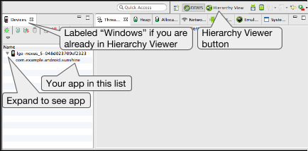
Note: Hierarchy Viewer is no longer being developed. To inspect the properties in our view hierarchy at runtime, we should instead use Layout Inspector in Android Studio. However, Layout Inspector does not currently provide profiling details about our layout performance.
Data Binding
Android offers a really cool library called the Data Binding Library. This can help us link any UI with actual data without having to call the findViewById for every view item.
Let’s see how to use this.
First thing, make sure we’re using the latest Android Studio, or at least something that’s later than 2.1 so that it can actually support dataBinding. These here are the steps that we’re going to go through to connect real data to our UI using dataBinding.
The first step is to enable dataBinding in our application. To do that, open up the build.gradle file and inside the Android section, make sure to set the dataBinding.enabled to true. And then sync to update our project.
android {
    ...
    dataBinding .enabled = true
}
The second step is to change the root tag in our layout XML to use a layout tag. Android automatically generates a binding class for any layout that includes this tag as its root. And we will need those binding classes later. So let’s go ahead and open up our activity_main.xml and then surround this with our layout tag.
<?xml version="1.0" encoding="utf-8"?>
<layout xmlns:app="http://schemas.android.com/apk/res-auto"
    xmlns:tools="http://schemas.android.com/tools"
    xmlns:android="http://schemas.android.com/apk/res/android" >

    <ScrollView android:id="@+id/scroll"
        android:layout_width="match_parent"
        android:layout_height="wrap_content">

        <android.support.constraint.ConstraintLayout
            android:orientation="vertical"
            android:layout_width="match_parent"
            android:layout_height="match_parent">

            ...

        </android.support.constraint.ConstraintLayout>
    </ScrollView>
</layout>
Next, we’ll be creating something called a binding instance. This will help us access those UI components from the code. Open up the MainActivity and create a variable for type ActivityMainBinding. This is the class that was generated for us based on the name of the layout. So activity_main becomes MainActivityBinding. Whatever we named our layout, the class would follow the same convention. The following step is to point the data binding instance to the correct content view. This is done using the DataBindingUtil class by calling the setContentView and passing in the actual main activity. This sets the context of our binding class to the elements in the layout we just passed.
The final step is to actually bind the data one by one using that binding instance we just created. Simply go through the attributes in the binding object one by one and set the text values to our data object.
public class MainActivity extends AppCompatActivity {

    //Create a data binding instance of type ActivityMainBinding
    ActivityMainBinding mBinding;

    @Override
    protected void onCreate(Bundle savedInstanceState) {
        super.onCreate(savedInstanceState);
        setContentView(R.layout.activity_main);

        /*
         * DataBindUtil.setContentView replaces our normal call of setContent view.
         * DataBindingUtil also created our ActivityMainBinding that we will eventually use to
         * display all of our data.
         */
        mBinding = DataBindingUtil.setContentView(this, R.layout.activity_main);

        // Load a BoardingPassInfo object
        BoardingPassInfo boardingInfo = DataUtils.generateBoardingPassInfo();
        //  Call displayBoardingPassInfo and pass the BoardingInfo instance
        displayBoardingPassInfo(fakeBoardingInfo);
    }

    private void displayBoardingPassInfo(BoardingPassInfo info) {

        // Use mBinding to set the Text in all the textViews using the data in info
        mBinding.textViewPassengerName.setText(info.passengerName);
        mBinding.textViewOriginAirport.setText(info.originCode);
        mBinding.textViewFlightCode.setText(info.flightCode);
        mBinding.textViewDestinationAirport.setText(info.destCode);

        SimpleDateFormat formatter =
                new SimpleDateFormat(getString(R.string.timeFormat), Locale.getDefault());
        String boardingTime = formatter.format(info.boardingTime);
        String departureTime = formatter.format(info.departureTime);
        String arrivalTime = formatter.format(info.arrivalTime);

        mBinding.textViewBoardingTime.setText(boardingTime);
        mBinding.textViewDepartureTime.setText(departureTime);
        mBinding.textViewArrivalTime.setText(arrivalTime);

        long totalMinutesUntilBoarding = info.getMinutesUntilBoarding();
        long hoursUntilBoarding = TimeUnit.MINUTES.toHours(totalMinutesUntilBoarding);
        long minutesLessHoursUntilBoarding =
                totalMinutesUntilBoarding - TimeUnit.HOURS.toMinutes(hoursUntilBoarding);

        String hoursAndMinutesUntilBoarding = getString(R.string.countDownFormat,
                hoursUntilBoarding,
                minutesLessHoursUntilBoarding);

        mBinding.textViewBoardingInCountdown.setText(hoursAndMinutesUntilBoarding);
        mBinding.textViewTerminal.setText(info.departureTerminal);
        mBinding.textViewGate.setText(info.departureGate);
        mBinding.textViewSeat.setText(info.seatNumber);
    }
}
Accessibility
Accessibility refers to the design of products, devices, services, or environments for people who experience disabilities. Android provides accessibility features like:
- TalkBack which is a pre-installed screen reader service provided by Google. It uses spoken feedback to describe the results of actions such as launching an app, and events such as notifications.
- Explore by Touch which is a system feature that works with TalkBack, allowing us to touch our device’s screen and hear what’s under our finger via spoken feedback. This feature is helpful to users with low vision.
- Accessibility settings that let us modify our device’s display and sound options, such as increasing the text size, changing the speed at which text is spoken, and more. and more.
Describe user interface controls. If we look at many of the designs of our favorite apps, we can immediately tell how many things work, simply because of their relative location on the screen. But if we cannot see these layouts due to a visual limitation, simply having android read out everything on the screen won’t tell us enough information about which is which.
That’s why Android offers the contentDescription attribute to describe what any view actually presents, this description text is not displayed anywhere on the screen, but if the user enables accessibility services that provide audible prompts, then when the user navigates to that control, the text is spoken.
<ImageView android:contentDescription="@string/origin_label"/>
Ideally, in any app, we would want to describe all ImageViews, ImageButtons and all Checkboxes using the contentDescription attribute.
ContentDescription is just one of many things we need to consider when building our app for accessibility, others include:
- Enable focus-based navigation which makes sure users can navigate our screen layouts using external hardware like bluetooth keyboards.
- No audio-only feedback which guarantees any audio feedback to always have a secondary feedback mechanism to support users who are deaf or hard of hearing
Localization
Localization (also known as Internationalization) is the adaptation of a product or service to meet the needs of a particular language, culture or desired population’s “look-and-feel”.
I. Translation:
We should always design our app in a way that can be easily translated to other languages. To do so, any text that we would expect to be translated like labels and titles and button descriptions should all be defined as a string resource in res/values/strings.xml.
This allows us to create other versions of strings.xml for other languages. This is done by creating a new values folder with the pattern value-xx where xx can be the abbreviation of any language from the ISO 639 code list here, for example res/values-fr/strings.xml will contain the french version of the strings.xml file with all the strings translated from the default language to french.
This way, when a user who has set up their phone to use french as the default language, android will automatically load the french version of strings and use all the pre-translated french labels.
Sometimes however, we would still want to use the strings resourses for strings that we don’t intend to translate, this includes strings representing identifiers for views or variable names os string formats etc.
For those strings, there’s an attribute called translatable that can be set to false to indicate that this string recourse should not be translated.
<string name="timeFormat" translatable="false">hh:mm a</string>
II. RTL support
If we’re distributing to countries where right-to-left (RTL) scripts are used (like Arabic or Hebrew), we should consider implementing support for RTL layouts and text display and editing, to the extent possible.
We can set image recourses to flip when RTL support is activated to indicate the correct direction using:
<vector android:autoMirrored="true"> </vector>
Another set of attributes related to RTL support are the android:layout_marginStart and android:layout_marginEnd that correspond to android:layout_marginLeft and android:layout_marginRight respectively, but only when the default language is English (or any LTR language), for RTL languages however, Start is mapped to Right and End is mapped to Left instead, the idea is that when the app runs on a device with a default RTL language , everything will get mirrored by switching margins and constraints to the other side.
Keep in mind that these Start and End attributes are relatively new, so to support older devices (prior to 4.1) we should still backup the Start and End margins with the outdated Left and Right ones with the same values, and if our app ends up running on a more recent device the Left Right margins are ignored and the Start End ones are used instead.
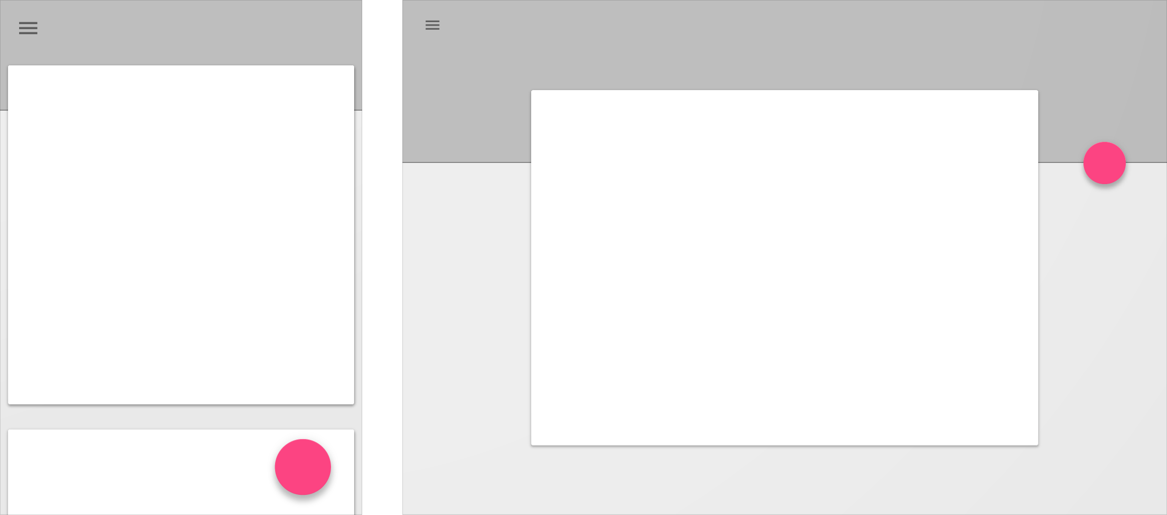
Responsive Design
A responsive UI is simply a UI that reacts to the amount of available space in the screen. Sometimes it seems like when we turn the phone into landscape, everything stretches out smoothly following the restraints that were created earlier. However, many times this seems like a huge waste of space, or an inappropriate landscape layout.
But that means we need a totally different layout for landscape mode. This is why Android offers something called alternate layouts. Basically, we can create an entire new XML layout file only for landscape mode. To do that, simply create a new folder called layout-land for landscape, and then add the activity_main inside layout-land folder. This will appear as another new XML file in Android Studio with the label land.
When we have this kind of layouts, we sometimes need use same portions of UI in both layouts, so instead of recreating them in both layouts, it’s wise to move each of them into a separate small layout themselves, and then use Android’s include tag to combine them in the default and landscape layout. Thisway if we need to update some of these portions, we only need to do that in one location.
<!-- layout-land/activity_main.xml -->
<layout xmlns:app="http://schemas.android.com/apk/res-auto"
    xmlns:tools="http://schemas.android.com/tools"
    xmlns:android="http://schemas.android.com/apk/res/android">

    <ScrollView
        android:id="@+id/scroll"
        android:layout_width="match_parent"
        android:layout_height="wrap_content">

        <android.support.constraint.ConstraintLayout
            android:orientation="vertical"
            android:layout_width="match_parent"
            android:layout_height="match_parent">

            ...

            <include
                app:layout_constraintLeft_toLeftOf="parent"
                app:layout_constraintTop_toBottomOf="@+id/textViewPassengerName"
                android:layout_marginTop="32dp"
                android:id="@+id/flight_info"
                layout="@layout/flight_info"
                android:layout_width="0dp"
                android:layout_height="wrap_content"
                app:layout_constraintRight_toLeftOf="@+id/textViewDepartureTimeLabel" />

            ...

        </android.support.constraint.ConstraintLayout>
    </ScrollView>
</layout>


<!-- layout/activity_main.xml -->
<layout xmlns:app="http://schemas.android.com/apk/res-auto"
    xmlns:tools="http://schemas.android.com/tools"
    xmlns:android="http://schemas.android.com/apk/res/android">

    <ScrollView
        android:id="@+id/scroll"
        android:layout_width="match_parent"
        android:layout_height="wrap_content">

        <android.support.constraint.ConstraintLayout
            android:orientation="vertical"
            android:layout_width="match_parent"
            android:layout_height="match_parent">

            ...

            <include
                app:layout_constraintLeft_toLeftOf="parent"
                app:layout_constraintTop_toBottomOf="@+id/textViewPassengerName"
                android:layout_marginTop="16dp"
                android:id="@+id/flight_info"
                layout="@layout/flight_info"
                android:layout_width="0dp"
                android:layout_height="wrap_content"
                app:layout_constraintRight_toRightOf="parent" />

            ...

        </android.support.constraint.ConstraintLayout>
    </ScrollView>
</layout>
References
Layouts API Guide
View reference
ViewGroup reference
Build a Responsive UI with ConstraintLayout
ConstraintLayout reference
Constraint Layout Codelab
Constraint Layout Project
Exploring the new Android ConstraintLayout by Joe Birch
Add Multi-Density Vector Graphics
Vector Drawable API Guide
Profile Your Layout with Hierarchy Viewer
Optimizing Layout Hierarchies
Data Binding Library
Making Apps More Accessible
Testing Your App’s Accessibility
Localization checklist
Designing for Multiple Screens
Supporting Different Screens