In this lesson we’ll give final touches to the UI, reviewing the Android Design Principles, play with fonts & colors, and how to keep the design consistent across the app and organized via styles and themes. Finally we will learn how to make UIs for different devices and screen sizes.
Index
- Android Design Principles
- Visual mocks and keylines
- Color & Fonts
- Styles & Themes
- Designing for multiple screens
Android Design Principles
Enchant me. Simplify my life. Make me amazing.
They’re the three key principles underlying the Android team’s creative vision for the platform and the apps that run on it.
Our goal must be to create an empowering experience for our users. And we do that by creating apps that are as aesthetically pleasing as they are functional and easy to use.
Studies suggest that users judge the quality of our app within the first 30 seconds, and a disproportionate amount of that judgement will be based not on the functionality, but on the visual aesthetics.
Does it look polished? Does it look professional? How easy is it to use? More than just looking pretty, the entire user experience is critically important. With 30 seconds to win users over, it’s critical that that onboarding process, that time and effort required to go from downloading our app to performing it’s main function, should be as short and frictionless as possible.
It should be fun to use. It should surprise in delightful ways through subtle animations and smooth transitions that contribute to a feeling of power and effortlessness. It should let users touch and interact with objects directly rather than having to use buttons and menus. And it should use rich imagery and pictures in place of lots of words and long sentences.
Create something that works like magic, so it never asks users for information that they’ve already provided. Provide simple shortcuts to complete complex tasks, and remember data settings and customizations making them available across every device.
While it’s good practice to create a familiar and welcoming experience by creating a look and feel that’s consistent with the platforms, styles and themes, it’s just as important to remember that this, and all the other principles, are really just a starting point for our own creative vision.
Visual mocks and keylines
One common way that developers go from a starting concept to a polished final app is to have a visual model in mind as we go. To create a cohesive design for our app, it’s a good idea to draw out a model of what we want our final app to look like. In fact, it’s often the job of a designer to create these models, which are referred to as mock ups.
A mock up is a model of an Android app that’s used for design evaluation. It’s usually a picture or animation of the final app. And detailed mock ups include specific colors to use, and markings called keylines.
Keylines are used to specify the exact size and spacing for components in an app layout.
Then, for every detail that’s provided in a mock up, it’s our job as developers to implement that in the app code. But how to make these decisions about layout and which colors and fonts to use. In general, we can follow something called material design guidelines. Material design for Android is a set of principles and guides for creating useful and beautiful visuals and interaction across platforms and devices.
Color & Fonts
Colors are a big part of app design, from branding to visual consistency. If we think about some nicely designed apps like Google Maps, music players, or email, they generally use only a few colors. And they use contrast to highlight different components within the app. In general, colors should always work together and help to distinguish between views and interactive components like buttons.
For these reasons, Android material design guidelines recommend having a primary color and an accent color. The primary color is the main color base for our app, Views and components like the menu bar will generally include this color. And the accent color is typically brighter, and serves to draw attention to key elements like buttons in an app. It’s common to chose three slightly different shades of the primary color to use and one accent color.
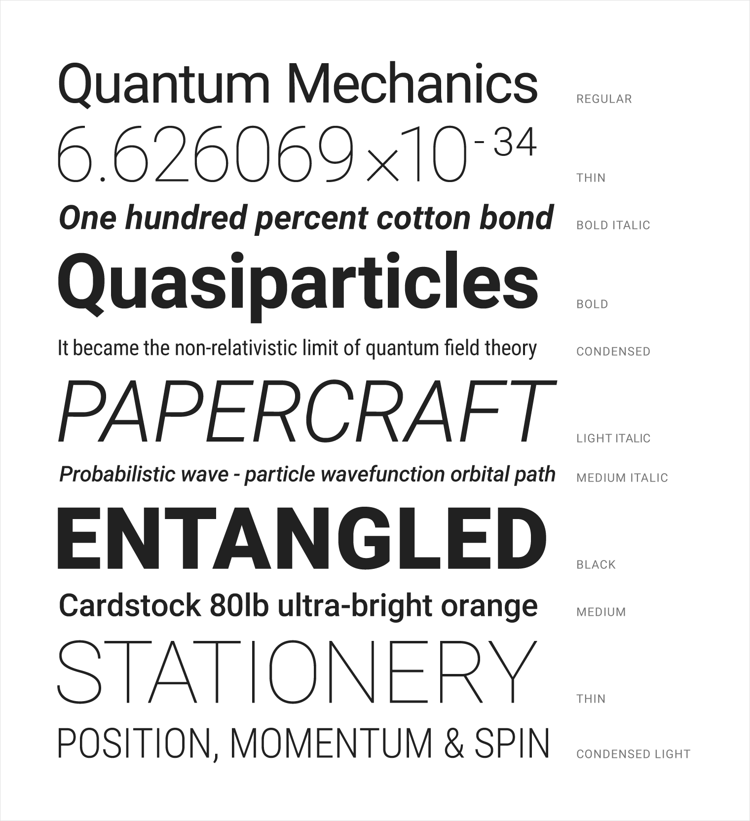
Another useful way to add consistency and distinguish different views in our app is through text and its different font and sizes. The default text for Android is a font called Roboto, which is designed to work across a range of differently sized platforms. It comes in a variety of font families, font-families are groups of fonts that share similar design characteristics, like serif or sans serif.
The Android material design site has recommendations for sizes and font families to use for readability. It’s typically good to stick with one font-family throughout an app and change the color, weight, or size when we need to make some text stand out. It’s also good practice to have only a few consistent styles for different text components and not just change the style at random.
One thing to note about text size is that it will be in units of sp, which stands for scale independent pixels. Most views will be in units of dips, or density independent pixels. Both dips and scale independent pixels will stay the same physical size across different resolution screens. Scale independent pixels are also used for accessibility purposes. For example, if someone changes their text size settings to be larger for visibility, then Android will enlarge any view whose size is in sp, accordingly.
To add new colors or modify the existing ones, we need to add them to a file in the values folder in our resources directory. It’s named colors.xml. In this colors.xml file, we already see some colors here. With the name and the hex code that defines their color, the names colorPrimary, colorPrimaryDark, and colorAccent are especially important. These are names for the default app in Android, so when our app is created, components like the menu bar and this special buttons like Fabs or radio buttons who will be colored base on these values.
<!-- res/values/colors.xml -->
<?xml version="1.0" encoding="utf-8"?>
<resources>
    <color name="colorPrimary">#3F51B5</color>
    <color name="colorPrimaryDark">#303F9F</color>
    <color name="colorAccent">#FF4081</color>
</resources>
And then we can define our custom colors and text in the layout XMLs files:
<!-- res/layouts/activity_main.xml -->
<?xml version="1.0" encoding="utf-8"?>
<FrameLayout
    xmlns:android="http://schemas.android.com/apk/res/android"
    android:layout_width="match_parent"
    android:layout_height="match_parent">

    <TextView
        android:id="@+id/someText"
        android:layout_width="wrap_content"
        android:layout_height="wrap_content"
        android:textColor="@color/purple"
        android:fontFamily="cursive"
        android:textSize="10sp"
        android:text="This is my tiny purple text" />
</FrameLayout>
Styles & Themes
A style is a collection of attributes that specify the look and format for a View or window. A style can specify attributes such as height, padding, font color, font size, background color, and much more. A style is defined in an XML resource that is separate from the XML that specifies the layout.
Styles in Android allow us to define the look and feel, for example colors and fonts, of Android components in XML resource files. This way we have to set common style attributes only once in one central place.
This is typically used for reducing styling duplication in a way highly analogous to CSS in the web development world. By specifying styles in one central file, we can then apply consistent styling across our application’s views.
Styles in conjunction with drawables are how more views are kept maintainable in the face of heavy UI customization. Styles work by defining style names associated with a series of properties to apply to a view. Styles can also inherit from other style and compound styles can be created as well.
For example, by using a style, we can take this layout XML:
<TextView
    android:layout_width="match_parent"
    android:layout_height="wrap_content"
    android:textColor="#00FF00"
    android:typeface="monospace"
    android:text="@string/hello" />
And turn it into this:
<TextView
    android:layout_width="match_parent"
    android:layout_height="wrap_content"
    android:textAppearance="@style/CodeFont"
    android:text="@string/hello" />
The attributes related to style have been removed from the layout XML and put into a style definition called CodeFont, which is then applied using the android:textAppearance attribute.
A theme is a style applied to an entire Activity or app, rather than an individual View, as in the example above. When a style is applied as a theme, every view in the activity or app applies each style attribute that it supports. For example, if we apply the same CodeFont style as a theme for an activity, then all text inside that activity appears in a green monospace font.
To create a set of styles, save an XML file in the res/values/ directory of our project. The name of the XML file must use the .xml extension, and like other resources, it must use lowercase, underscores, and be saved in the res/values/ folder. The root node of the XML file must be <resources>.
For each style we want to create, we need complete the following series of steps:
- Add a
<style>element to the file, with a name that uniquely identifies the style. - For each attribute of that style, add an
<item>element, with a name that declares the style attribute. The order of these elements doesn’t matter. - Add an appropriate value to each
<item>element.
<!-- res/values/styles.xml -->
<resources>
    <style name="AppTheme" parent="Theme.Material">
        <item name="colorPrimary">@color/primary</item>
        <item name="colorPrimaryDark">@color/primary_dark</item>
        <item name="colorAccent">@color/accent</item>
    </style>
</resources>
In many cases, we may want to extend a style and modify certain attributes. The parent attribute in the <style> element lets us specify a style from which our style should inherit properties. We can use this to inherit properties from an existing style and then define only the properties that we want to change or add.
<style name="LargeFont">
    <item name="android:textSize">40sp</item>
</style>

<style name="LargeBlueFont" parent="@style/LargeFont">
  <item name="android:textColor">#00007f</item>
</style>
If we want to inherit from styles that we’ve defined ourselves, we do not even have to use the parent attribute. Instead, as a shortcut just prefix the name of the style we want to inherit to the name of our new style, separated by a period:
<style name="LargeFont">
    <item name="android:textSize">40sp</item>
</style>

<style name="LargeFont.Red">
    <item name="android:textColor">#C80000</item>
</style>
We can continue to extend styles inheriting from them by using multiple periods:
<style name="LargeFont.Red.Bold">
    <item name="android:textStyle">bold</item>
</style>

<style name="LargeFont.Red.Big">
    <item name="android:textSize">30sp</item>
</style>
We can’t inherit Android built-in styles this way. To reference a built-in style we must use the parent attribute:
<style name="CustomButton" parent="@android:style/Widget.Button">
    <item name="android:gravity">center_vertical|center_horizontal</item>
    <item name="android:textColor">#FFFFFF</item>
</style>
In some cases, we want to apply a consistent theme to all activities within our application. Instead of applying the style to a particular individual view, we can apply a collection of styles as a Theme to an Activity or application. When we do so, every View within the Activity or application will apply each property that it supports.
In many cases, we will want to customize the default appearance of views within our application. For example, we may want to set the textColor of a TextView or Button as the default for our application. This can be done by defining styles that inherit from the defaults and then overwriting those properties in res/values/styles.xml:
<resources xmlns:android="http://schemas.android.com/apk/res/android">
    <!-- ...generated stuff here -->

    <!-- This is the generated app theme -->
    <style name="AppTheme" parent="AppBaseTheme">
        <!-- These are our custom properties -->
        <item name="android:buttonStyle">@style/Widget.Button.Custom</item>
        <item name="android:textViewStyle">@style/Widget.TextView.Custom</item>
    </style>

    <!-- This is the custom button styles for this application -->
    <style name="Widget.Button.Custom" parent="android:Widget.Button">
      <item name="android:textColor">#0000FF</item>
    </style>

    <!-- This is the custom textview styles for this application -->
    <style name="Widget.TextView.Custom" parent="android:Widget.TextView">
      <item name="android:textColor">#00FF00</item>
    </style>
</resources>
Notice that we use the AppTheme generated for us to make modifications to buttonStyle and textViewStyle in order to determine the default styles for those controls. Next, we inherit from the default Widget.Button or Widget.TextView to take the default styles and make our changes
Designing for multiple screens
Android powers hundreds of device types with several different screen sizes, ranging from small phones to large TV sets. Therefore, it’s important that we design our application to be compatible with all screen sizes so it’s available to as many users as possible.
But being compatible with different device types is not enough. Each screen size offers different possibilities and challenges for user interaction, so in order to truly satisfy and impress our users, our application must go beyond merely supporting multiple screens: it must optimize the user experience for each screen configuration.
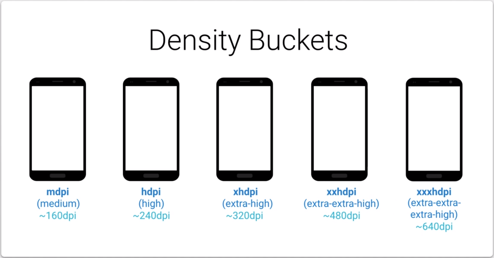
Screen density. The quantity of pixels within a physical area of the screen; usually referred to as dpi (dots per inch). For example, a “low” density screen has fewer pixels within a given physical area, compared to a “normal” or “high” density screen. For simplicity, Android groups all actual screen densities into six generalized densities: low, medium, high, extra-high, extra-extra-high, and extra-extra-extra-high.
One common pitfall we must avoid when designing our layouts is using absolute pixels to define distances or sizes. Defining layout dimensions with pixels is a problem because different screens have different pixel densities, so the same number of pixels may correspond to different physical sizes on different devices. Therefore, when specifying dimensions, always use either dp or sp units. A dp is a density-independent pixel that corresponds to the physical size of a pixel at 160 dpi. An sp is the same base unit, but is scaled by the user’s preferred text size (it’s a scale-independent pixel), so we should use this measurement unit when defining text size (but never for layout sizes).
For example, when we specify spacing between two views, use dp rather than px:
<Button android:layout_width="wrap_content"
    android:layout_height="wrap_content"
    android:text="@string/clickme"
    android:layout_marginTop="20dp" />
When specifying text size, always use sp:
<TextView android:layout_width="match_parent"
    android:layout_height="wrap_content"
    android:textSize="20sp" />
Since Android runs in devices with a wide variety of screen densities, we should always provide our bitmap resources tailored to each of the generalized density buckets: low, medium, high and extra-high density. This will help us achieve good graphical quality and performance on all screen densities.
Using configuration qualifiers
Android supports several configuration qualifiers that allow us to control how the system selects our alternative resources based on the characteristics of the current device screen. A configuration qualifier is a string that we can append to a resource directory in our Android project and specifies the configuration for which the resources inside are designed.
To use a configuration qualifier:
- Create a new directory in our project’s
res/directory and name it using the format:<resources_name>-<qualifier><resources_name>is the standard resource name (such as drawable or layout).<qualifier>is a configuration qualifier specifying the screen configuration for which these resources are to be used (such as hdpi or xlarge).
- Save the appropriate configuration-specific resources in this new directory. The resource files must be named exactly the same as the default resource files.
For example, xlarge is a configuration qualifier for extra-large screens. When we append this string to a resource directory name (such as layout-xlarge), it indicates to the system that these resources are to be used on devices that have an extra-large screen.
Be aware that, when the Android system picks which resources to use at runtime, it uses certain logic to determine the “best matching” resources. That is, the qualifiers we use don’t have to exactly match the current screen configuration in all cases in order for the system to use them. Specifically, when selecting resources based on the size qualifiers, the system will use resources designed for a screen smaller than the current screen if there are no resources that better match (for example, a large-size screen will use normal-size screen resources if necessary). However, if the only available resources are larger than the current screen, the system will not use them and our application will crash if no other resources match the device configuration.
smallestWidth qualifier
This qualifier refers to the fundamental size of a screen, as indicated by the shortest dimension of the available screen area. Specifically, the device’s smallestWidth is the shortest of the screen’s available height and width (we may also think of it as the “smallest possible width” for the screen). We can use this qualifier to ensure that, regardless of the screen’s current orientation, our application’s has at least
For example, if our layout requires that its smallest dimension of screen area be at least 600 dp at all times, then we can use this qualifier to create the layout resources, res/layout-sw600dp/. The system will use these resources only when the smallest dimension of available screen is at least 600dp, regardless of whether the 600dp side is the user-perceived height or width. The smallestWidth is a fixed screen size characteristic of the device; the device’s smallestWidth does not change when the screen’s orientation changes.
This is an alternative to the generalized screen size qualifiers (small, normal, large, xlarge) that allows us to define a discrete number for the effective size available for our UI. Using smallestWidth to determine the general screen size is useful because width is often the driving factor in designing a layout. A UI will often scroll vertically, but have fairly hard constraints on the minimum space it needs horizontally. The available width is also the key factor in determining whether to use a one-pane layout for handsets or multi-pane layout for tablets. Thus, we likely care most about what the smallest possible width will be on each device.
References
Material Design Guidelines
Everything You Need To Know About Wireframes And Prototypes by Nick Babich
Everything You Need to Know About UX Sketching by Nick Vyhouski
Material Design Color Guidelines
Material Design Color Tool
Material Design Fonts Guidelines
Downloadable Fonts API Guide
Fonts in XML API Guide
Styles and Themes
Resource Types API Guide
Codepath Styles and Themes
Android: Working with themes and styles by Joanne Kao
Theme vs Style by Chris Banes
Designing for Multiple Screens Training
Supporting Multiple Screens API Guide